Websitebanaye@gmail.com
+91-9814143394
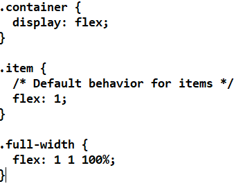
To make one flex item take up the full width of its container in a flexbox layout, you can use the flex property in CSS. Here's a step-by-step guide to achieve this
Create a container and add flex items to it.
Use the display: flex; property on the container to enable flexbox layout.
You can use the flex property to make one item expand to fill the available space.
1 (flex-grow): This makes the item grow to fill available space.
1 (flex-shrink): This allows the item to shrink if necessary.
100% (flex-basis): This sets the base size of the item to 100% of the container’s width.
By setting flex-basis to 100%, the item will initially take up the full width of the container, and the flex-grow value ensures it can grow to fill any remaining space.
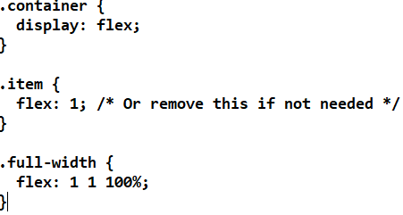
If you want other flex items to take their normal size while the specific item takes full width, you can define their sizes explicitly or let them default.
Your experience on this site will be improved by allowing cookies.


